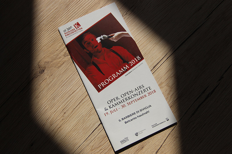
This year’s jubilee year of the classical festival Kirchstetten made the work of our graphic artists particularly exciting. Because the 20 years classical festival started with a relaunch of the corporate design.
Corporate Design
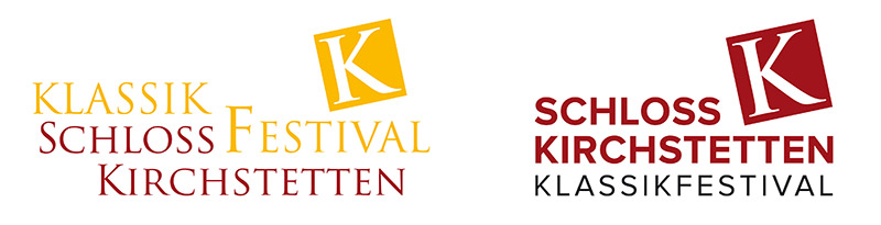
For the visual clue of the non-profit association “Kultur in Schloss Kirchstetten” (Culture in the castle Kirchstetten) we styled the design in a completely modern and reduced way.
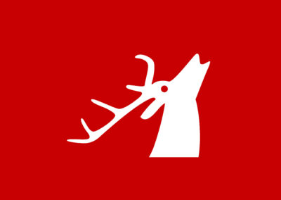
The logo has been revised, subtleties adjusted and a new and a strong linear typography chosen. The reduction to two colors – red & black – adds the overall picture an intense clarity, compact effect and facilitates readability and visual perception.
LOGO
– before / after –
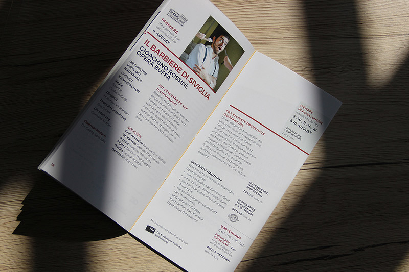
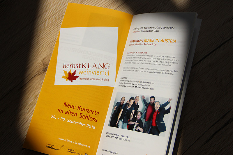
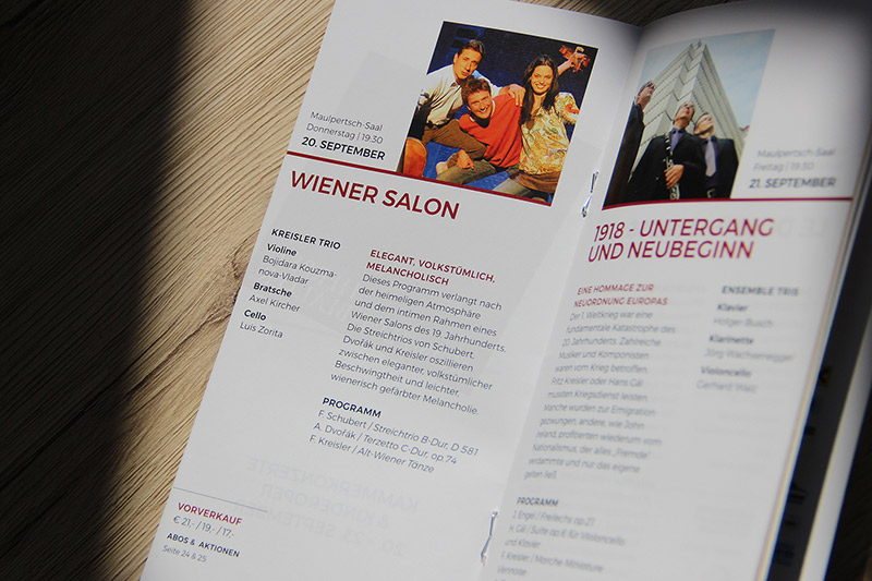
Layout design print
The “square K” runs like a common thread evenly through the design. As a recognizable element it can be found in square pictures, icons and boxes. The new metaphorical language flows into a harmonious whole with the discreetly used earlier main typography.
Corporate Identity
Since 2007 iService – full service agency – has been managing the association “Kultur in Schloss Kirchstetten” in a confidental relation and is responsible for the entire corporate identity.
Works
iService projects in detail
Works in detail.